Every field on your report card now has a Show on report toggle next to it in Settings — business address, licenses, certifications, signature, phone, website, and email. Two new fields join them: years in business and total inspections, both off by default until you turn them on. Need an exception for one job? Open an inspection's Details tab and expand Report Visibility to override any of these just for that report, without changing your account default.
A Show on report toggle next to every business-profile field in Settings
Two new report fields — years in business and total inspections — off by default
Per-inspection Report Visibility overrides on the inspection Details tab
Locks along with everything else once a published, auditable report is finalized
Building out a subsection field by field is the slowest part of setting up a template. There's now a Generate with AI button next to Add field wherever you edit one — in the template editor and in your request form's Customize questions screen. Describe what you want in plain English, like 'Add fields for roof material, age, and overall condition with a defect checklist,' and Eave writes the fields, sets their types and options, wires up conditional visibility, and — on templates — adds warning and home-care triggers. It edits the subsection you're looking at rather than starting over: ask it to add three fields to a subsection that already has ten, and the other ten are untouched. The result lands in the editor exactly like a manual edit, so nothing saves until you review it and hit save yourself. Three free generations per account, then it's part of a paid plan alongside AI summaries and AI template imports.
Generate with AI on any subsection, in templates and your request form
Describe fields, conditions, and (for templates) warnings and home-care tips in plain English
Edits the existing subsection in place — untouched fields are left alone
Nothing saves until you review the result and hit save yourself
Scheduling had been split across two places for no reason you could see: the Scheduling page held your time off and your public request link, while everything that actually decided when a client could book — your working hours, your inspection duration, your buffer — lived in Settings. It is now one page with three tabs, organised by how often you touch a thing. Links has both of your booking links side by side, which is the point: the public request link is for a job you do not have yet, and the per-inspection booking link is for one you do, and side by side the difference explains itself. Underneath both is a strip of chips showing the rules they share — your hours, how long a job takes, your buffer, your booking window, your timezone — so you never have to wonder which link a setting affects. Availability is everything that used to be in Settings, unchanged and in one place. Time off & blocks is your vacations and your recurring lunch, with a line at the top spelling out the arithmetic: open slots equals your weekly hours minus booked inspections minus everything on that tab. Settings → Account → Scheduling still exists and still works — both edit the same thing, so nothing you have bookmarked breaks. Three new things came with it. Your public request link now has a QR code, downloadable as SVG for print or PNG for anywhere else, so it can go on a yard sign or the back of a van and a phone camera opens it. The booking window is now yours to set: minimum notice was fixed at 12 hours and now runs from none — same-day work is fine — up to a week, and how far ahead clients can book was fixed at 45 days and now runs from two weeks to six months. It only limits what clients are offered; you can still schedule anything yourself, whenever. And you can now turn off confirming every request, so the time a client picks on a booking link is booked immediately and you are told rather than asked — the notification and the email still arrive, and everyone who would attend gets the confirmed time straight away. That one is per-inspection booking links only. Requests through your public link always wait for you, because anyone can open that one. You can also now choose who gets a booking link by default — your clients only, your clients and the buyer's agent, or everyone on the inspection — and still override it per job.
Scheduling is one page with three tabs — Links, Availability, and Time off & blocks
Both booking links explained side by side, over a strip showing the rules they share
A downloadable QR code for your public request link — SVG for print, PNG for everything else
Set your own minimum notice, from same-day booking up to a week out
Set how far ahead clients can book, from two weeks to six months
Optionally skip confirming — a client's pick lands on your calendar immediately and you're told, not asked
Choose who gets a booking link by default, and still override it per job
Settings → Account → Scheduling still works and edits the same thing
Until now there was nowhere in Eave to simply look at your month. The inspections list is a list, sorted by whatever column you last clicked. The dashboard shows the next ten. The only thing shaped like a calendar was inside the scheduling modal, and that one exists to help you place a new job, not to review the ones you already have. Scheduling now has a Calendar tab, and it opens there by default. It is a month grid of your own inspections — not your organization's, yours, the same scoping the rest of scheduling uses — and every job is colored by what it needs from you. Indigo is scheduled: a time is confirmed and everyone knows it. Amber is waiting on you: a client picked a slot through one of your booking links and it does not become real until you accept it. Gray is a draft: an address and a template quick-created on site or arrived through your request link, not a committed job yet. That distinction is the whole point of the colors. A month that shows you eleven inspections is less useful than a month that shows you eleven inspections of which two are still waiting on your yes. When a job is both a draft and a pending request — which is exactly what a lead from your public request link is — it shows amber, because the thing you can act on today outranks the thing you cannot. Days you do not work, and days you have blocked off, are shaded, so a gap in the middle of your week reads as a gap rather than as free time. Click any day and the same to-scale timeline the scheduling modal uses opens underneath it, drawing your working hours, your time off, your recurring blocks, and each job in its real position with its drive-time buffer around it. Click a job on that timeline and you land on the inspection. Above the grid is a strip for the requests that cannot sit on a calendar at all: the ones where a client asked you to pick a time rather than choosing one themselves. They have no date, so no calendar day can hold them, and they were easy to forget. Now they are the first thing on the page until you deal with them. The status colors carry into the scheduling modal too, so placing a new job now shows you which of your existing ones are confirmed and which are still pending.
A month calendar of your inspections, on the Scheduling page
Color-coded — indigo scheduled, amber waiting on your confirmation, gray draft
Requests with no date get a strip above the grid so they stop getting lost
Click a day for the to-scale timeline, with your hours, time off, and buffers
Click a job to open the inspection
Non-working days and time off are shaded, so gaps read as gaps
Your dashboard has always been good at telling you what is coming up and what you made. It has never been good at telling you what you owe someone. That information existed, but it was scattered one inspection at a time: a booking request only showed up if you opened that job, a draft only showed as a badge on the inspections list, an unpaid inspection was a number in Outstanding Balances with no way to find out which job it belonged to, and a report PDF that failed to generate did not show up anywhere at all. Between the revenue cards and Upcoming Inspections there is now a Needs your attention table. Every inspection with something open on it gets exactly one row, showing the single most urgent thing and linking straight to the stage that resolves it. One row per job, not one per problem — a job that is both overdue and unpaid shows you the overdue report, and the unpaid balance surfaces on its own once you have published. It catches ten things. Clients waiting on you: a booking request to confirm or decline, a client who asked you to pick the time instead, a draft that still needs client details before it can be published. Report work: an inspection whose date has passed with the report still unpublished, and a report PDF that failed to generate. Money and paperwork: a payment that was declined, a published report that has not been paid for, and an agreement you sent that the client has not signed — which matters, because an unsigned agreement locks them out of the report. And scheduling: a job with no date on it at all, and the one that is easiest to miss entirely — attendees who were emailed a time that has changed since, and are now holding the wrong one. Some of it deliberately stays quiet. An unsigned agreement for a job three weeks out is normal, so it waits until the job is close. A job with a booking link out with the client is waiting on them, not on you. And attendees with no email address on file are not a task you can do anything about. When you have nothing open, the table is not there at all.
A "Needs your attention" table on the dashboard, above Upcoming Inspections
Booking requests to confirm, clients waiting on you to pick a time, drafts to finish
Reports overdue after the inspection date, and PDFs that failed to generate
Declined payments, unpaid published reports, and agreements still unsigned
Attendees holding a stale time after a reschedule — previously invisible
One row per job, most urgent first, linking straight to where you fix it
Scheduling has always started with you: you create the inspection, then send that client a link to pick a time. There was nothing for the person who found your website at 9pm and wanted to ask about a house. Now there is. Turn on Accept inspection requests online in Settings → Scheduling and you get one permanent link to put anywhere — your site, your email signature, the back of a business card. Anyone who opens it describes the property, answers whatever questions you've set up for it, leaves their contact details, and — if you publish working hours — picks a time from your real open slots. It lands as a draft inspection with the address, name, email and phone already filled in, plus a notification, a push, and an email. You confirm or decline exactly like a booking request, then Complete Draft fills in the fee, agents and agreement. Nothing is booked and nothing is emailed on your behalf until you say so. The link doesn't need working hours to work — without them, visitors just send the request and you schedule it — and turning the feature off keeps your URL, so a printed card never goes dead. By default the form asks one fixed question, "What do you need inspected?", but you don't have to leave it that way: go to Scheduling → Customize questions and add whatever you actually need to quote a job — square footage as a number, foundation type as a dropdown, add-ons like radon or a sewer scope as a multi-select, a date, a yes/no, a rating — using the same field editor you already use for templates, including conditional questions that only appear when an earlier answer calls for them. Every answer arrives on the draft inspection alongside the address and contact details, and in the email, listed question by question, saved with the question exactly as it read at the time so editing your form later never changes a request someone has already sent — and unlike the old free-text notes, they stay on the inspection after you confirm it, right where you need them when you're setting a fee.
One permanent request link for your website, email signature, or business card
Requests arrive as draft inspections with the client's address, name, email and phone already filled in
Choose the questions your link asks — text, number, yes/no, dropdown, multi-select, rating and date — with the same editor you use for templates
Conditional questions that only appear when an earlier answer calls for them
Works with or without published working hours — with them, visitors pick a real open slot
A requested time holds that slot, so two people can't ask for the same morning
Answers arrive on the draft inspection and in your email, listed question by question, and stay on the inspection after you confirm it
Confirm or decline it exactly like a booking request, then Complete Draft for the rest
Turning it off keeps your link, so anything already printed still works when you turn it back on
The iOS app just got its biggest update yet, and it's live in the App Store now — update to get it. Until now, the only way to find out that a client had booked a slot, signed the agreement, or paid was to open your email or the web app. The app now has its own Notifications tab, and it can alert your phone the moment something happens. The app has been reorganized around a bottom tab bar — Inspections, Notifications, and a new Account tab that gathers up the settings that used to hide behind the profile icon. The Notifications tab shows everything the web bell shows: booking requests, agreement signatures, payments received and failed, and organization invitations, which you can accept or decline right there. Tapping a notification opens the inspection it belongs to. The first time you open the tab, the app asks whether you'd like push notifications; say yes and your phone will alert you as things happen, even when the app is closed. You choose which kinds are worth interrupting you for — booking requests, agreement signatures, payments, and organization updates each have their own switch, in Account on your phone or under Settings → Notifications on the web. The same update closes a gap at the other end, too: the app has always let you start an inspection in seconds on site — just the address and a template — but back at the desk those inspections looked like any other, and the web app wouldn't let you publish their reports without explaining why. They're now clearly marked with a grey Draft badge, and a short guided flow on the web walks you through the clients, the buyer's agent, the fee, and everything else the on-site form skipped, pre-filled from the defaults in your settings. If you'd rather not be alerted at all, the Notifications tab and the Draft flow both keep working either way. Update the app from the App Store to get all of it.
A Notifications tab in the iOS app, with everything the web bell shows
Push alerts when a client books, signs, or pays — even with the app closed
A new Account tab gathering subscription, privacy, and sign-out
Inspections started on the go now show a Draft badge on the web
A guided flow to add clients, agents, and a fee to a draft
Defaults from your settings pre-fill nearly everything
You can already edit a template while you're filling out an inspection — rename a field that never made sense, delete one you never use, add a photo field for the attic, drag a section into the order you actually work in. Until now all of that stayed inside the one inspection. The next job started from the same unchanged template, and the only way to make an improvement stick was to remember it and re-make it by hand in the template editor. There's now a Template step at the end of the inspection journey that closes that loop. It appears only on inspections where you actually changed something, and it lists every change as its own line — 'Renamed Type to Roof Type', 'Added the field Attic photos', 'Reordered the subsections in Exterior' — with a checkbox each, so you keep the two that were real improvements and leave the three that were one-off notes for that house. Apply them to the template the inspection came from, or save the whole set as a brand-new template. Eave also checks your template as it stands right now, not as it was when you started the inspection: if you or a teammate has edited the same field since, that change is flagged as a conflict, shown with both versions, and left unchecked so you decide rather than silently overwriting their work. Anything already in your template quietly drops off the list, so the step empties itself out as you go. Your report is never touched — this only ever changes templates.
A Template step that appears when you edited the template on the fly
Every change listed separately, with a checkbox each
Apply to the source template, or save the set as a new one
Conflicts flagged with both versions when the template has changed since
Changes already in your template drop off the list automatically
You no longer have to retype your pre-inspection agreement to use it in Eave. On the Agreements page there's a new Import from PDF button: upload the agreement you already use — a PDF, TXT, or HTML file — and Eave reads it and turns it into an editable template. It drops the page headers, footers, and page numbers that repeat on every page, rejoins words split across line breaks, and works out which lines are section headings and which are bullet lists. It also looks for the fill-in spots your document already has — placeholders from other software like [Client Name] or <<Inspector Name>>, and labeled blanks like 'Inspection Fee: ______' — and converts them into Eave merge fields that fill in automatically for each inspection. The conversion is mechanical rather than AI-driven, so it's fast and free, but it is a best guess at the structure of a PDF. The result opens in the editor with a banner listing exactly what was changed and what couldn't be matched, and nothing is saved until you click Save. Give it a read before you do — especially the merge fields.
Upload a PDF, TXT, or HTML agreement and get an editable template back
{
"Placeholders like [Client Name] and blanks like \"Inspection Fee": "____\" become merge fields"
}
Page headers, footers, and page numbers are stripped automatically
A review banner names every change and everything it couldn't match
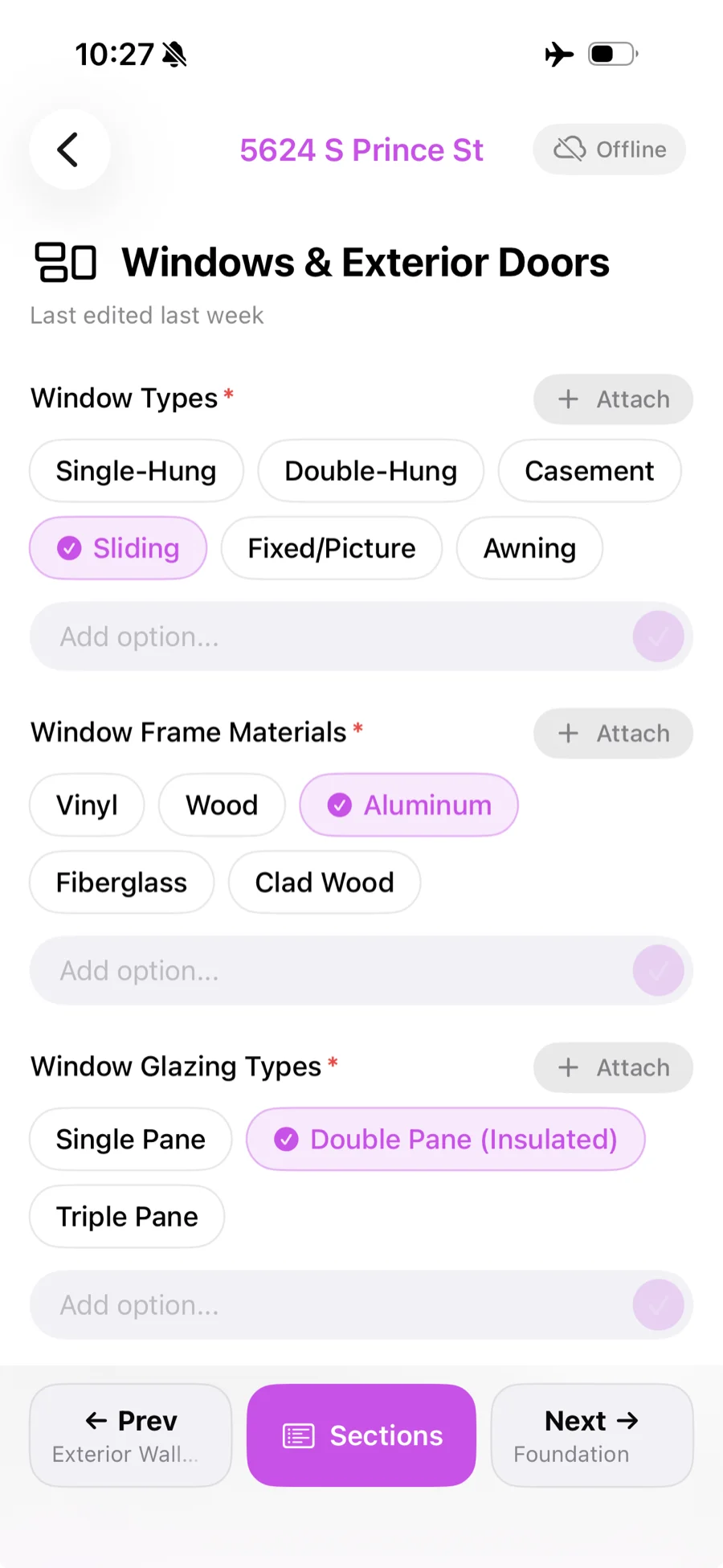
The Eave iOS app is live on the App Store. It's a companion to the web app, built for the field: fill out inspections, attach photos, warnings, and descriptions, and everything saves automatically as you go — including when you lose signal. Edits made offline queue up and sync the moment you're back in range, so a basement or a rural property with no bars won't slow you down anymore. A new section navigator lets you jump straight to any section, search by name, and see a completion count for each one at a glance. And photos can now be annotated right in the app — draw a circle, an arrow, or add text to point out exactly what you mean before it lands in the report. Building and editing templates is still a web-only task, so nothing changes there. Download it free from the App Store.
Fill out inspections offline — edits sync automatically once you're back online
New section navigator with search and per-section completion counts
Annotate photos with circles, arrows, and text before they land in the report
Attach menu for photos, descriptions, and warnings on any field
Building an agreement template meant clicking a merge field, watching {{property_address}} appear at the very bottom of the document, then scrolling down to cut and paste it where you actually wanted it. Now it goes in at your cursor — or replaces whatever you've highlighted. Merge fields also stop looking like code. Each one renders as a labelled chip reading 'Property address' instead of {{property_address}}, so you can see at a glance which parts of the agreement fill themselves in, and a chip deletes as a single unit rather than leaving a half-broken token behind. Two more ways to reach them: type / in the editor and merge fields now appear at the bottom of the command menu alongside headings and lists, or just type { to get the merge-field list on its own. Existing templates pick all of this up automatically — nothing to migrate, and the agreement your clients see is unchanged.
Merge fields insert at your cursor, or replace the text you've selected
Each one shows as a labelled chip — "Property address", not {{property_address}}
A chip deletes in one keystroke instead of leaving a broken token
Type / and pick a merge field from the command menu, or type { for the list on its own
Bold and italic formatting on a merge field is now kept when you save
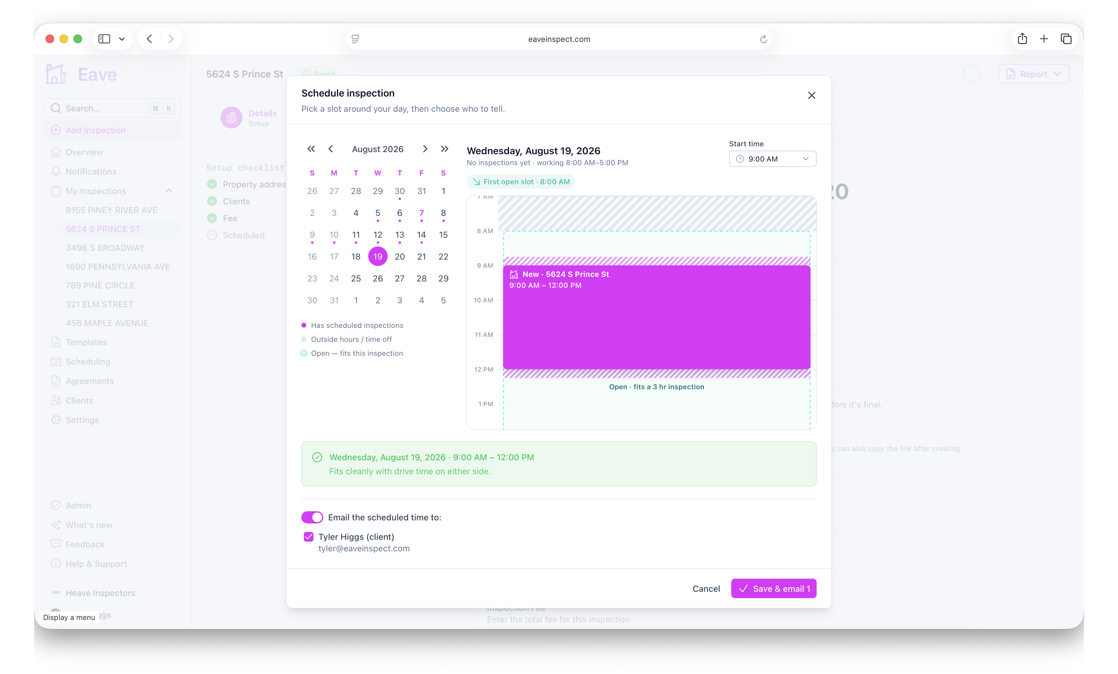
Your clients have always been able to see your real availability — the booking page only ever offers slots that fit around your other jobs, your time off, and your drive time. You couldn't. Picking a date yourself was a bare calendar and a time dropdown, so the only way to know whether 11:30 on Thursday was free was to remember. Set date & time now draws the day you're booking into: your other inspections at their real length with the buffer either side, your time off and recurring blocks, your working hours, and the open gaps big enough for a full inspection. Click a gap to drop the inspection in, or use a shortcut like 'Right after 1420 Birch Ct'. If what you pick doesn't fit, a line underneath says exactly why — overlaps your lunch, runs past your workday, leaves less than 30 minutes of drive time — and offers the nearest time that does. It's your calendar, so a conflict is a warning and never a wall. The same window opens from Add Inspection, so you get the context before the inspection even exists.
Setting a date now draws your other inspections, time off, and working hours to scale
Open gaps big enough for a full inspection are outlined — click one to book it
Conflicts explain themselves and offer the nearest time that fits
Shortcuts like "Right after 1420 Birch Ct" place the inspection with your drive time already allowed for
The same view opens from Add Inspection, not just from an existing inspection
The booking page used to offer exactly one path: pick a day, pick a time, submit. Plenty of clients aren't in a position to do that — they're relocating, they're at work, or they genuinely don't mind which morning it is. Now there's an 'I'm flexible, you pick a time' option right under the time slots, and it's the only thing shown when you have no open availability at all, so the page never dead-ends into phone tag. Alongside it, setting an inspection's date has been rebuilt: one window where you pick the day and time together and tick who to email, so the clients and the buyer's agent actually find out when the inspection is. The Scheduling card then tells you who was told and warns you if you reschedule after telling them. Clients are also now asked whether they'll be at the inspection, and that answer sticks to the inspection instead of getting lost in the notes.
"I'm flexible — let your inspector pick a time" is now an option on every booking page
No open slots no longer dead-ends the client — they can still send you a request
Setting a date now offers to email the time to your clients and the buyer's agent
The Scheduling card shows who was told, and warns you when you reschedule after telling them
Clients say whether they'll attend, and the answer stays on the inspection
When you text a client their report link, it used to show up as a bare blue URL. Now it unfurls into a branded Eave card with an image and a title, the same way links from other apps do. The same applies to payment, agreement, scheduling, and repair request links. Importantly, the preview deliberately never includes the property address or your client's name — those previews are generated on Apple's and Google's servers, so anything in them leaves our systems. The card says who the report is from, and nothing more.
Report, payment, agreement, scheduling, and repair request links show a branded preview card
Previews name your business, never the property address or client
Works in iMessage, WhatsApp, Slack, and anywhere else links unfurl
Client links stay out of Google — they were never indexed, and now that's explicit
The summary page can now draft itself. Hit Generate with AI and Eave writes your Final Comments from the findings and answers already in the inspection — then you edit it like any other text. The page is also simpler: Suggested Improvements and Positive Attributes are gone, leaving Final Comments as the one place to write.
Generate with AI drafts your Final Comments from the inspection's own findings
One prose field instead of three on the summary page
Rating, Yes/No, and single-select fields now have a Clear button, so picking the wrong answer no longer means overwriting it with another guess. Every subsection also now explains that fields left blank won't appear in the client-facing report.
Clear button on rating, Yes/No, and dropdown fields
A note in every subsection on which blank fields skip the report
When you import a template from Spectora, HomeGauge, or anywhere else, deficiency checklists now come across as Issues fields — so selecting one automatically writes a finding into the client's report. Every section and subsection also gets an icon.
Deficiency lists import as Issues fields, not plain checkboxes
Each issue arrives with a severity and client-facing wording
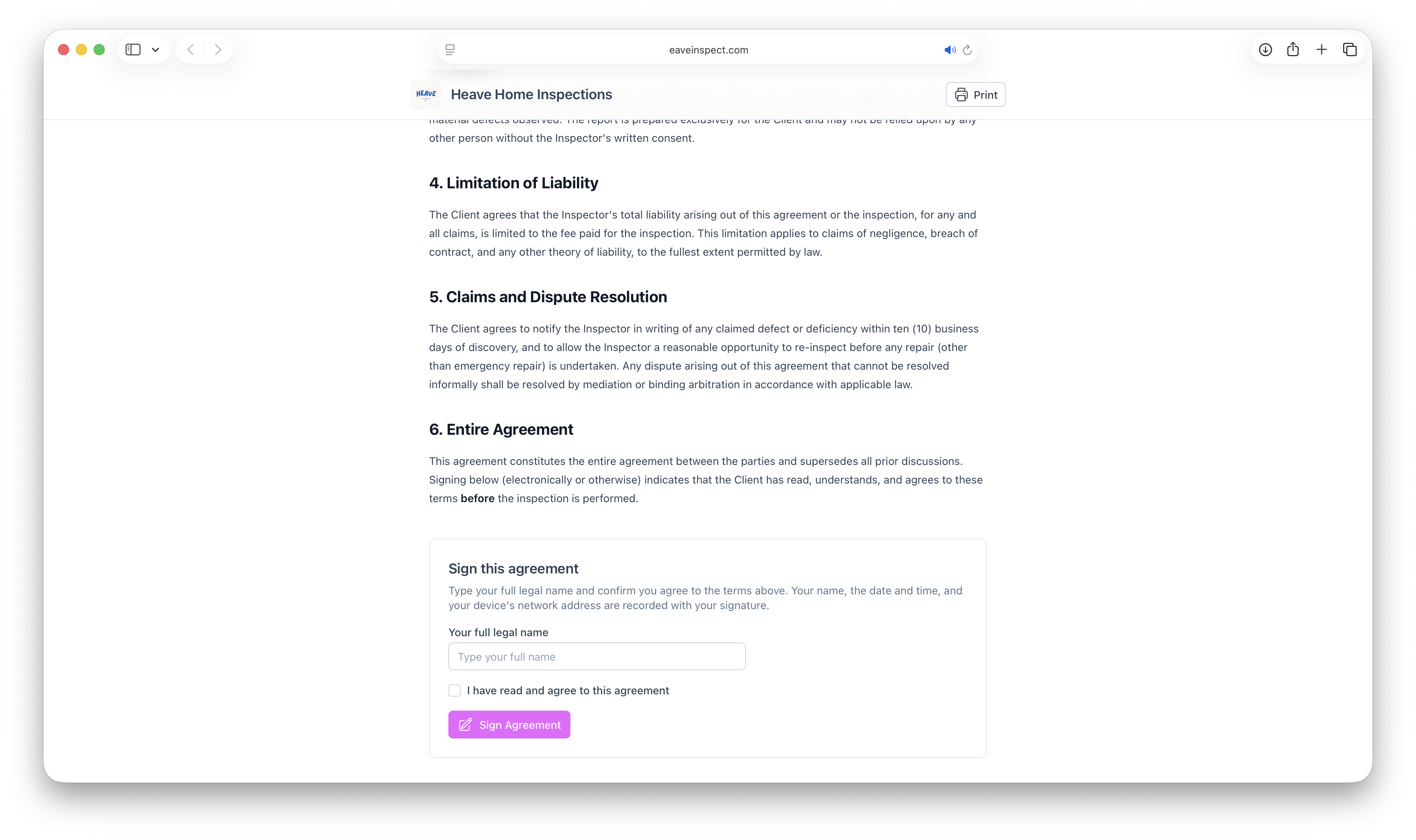
Write your pre-inspection agreement once and attach it to any inspection. Clients get a signing link automatically, and the published report stays locked until they've signed.
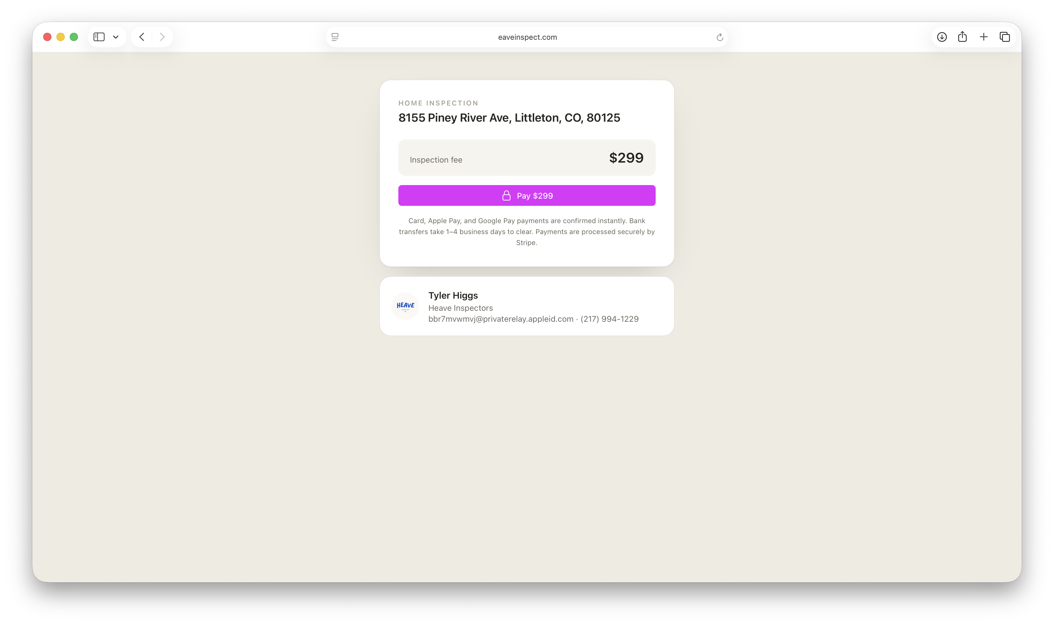
You can now collect the inspection fee online. Send a pay link — or have Eave email it automatically — and clients pay by card, Apple Pay, Google Pay, or bank transfer. The money goes straight to your own Stripe account.
Clients pay by card, Apple Pay, Google Pay, or bank transfer
Money lands in your own Stripe account — Eave takes no cut
Optionally hold the report until the payment clears